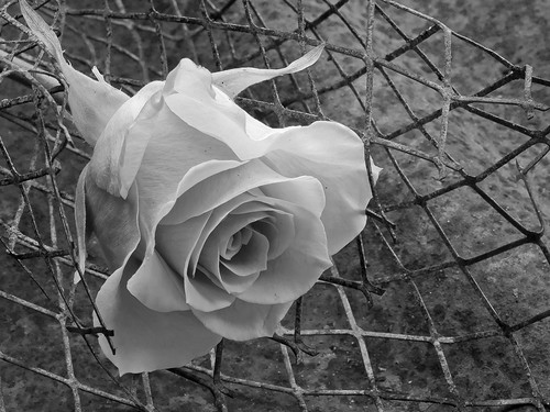
My original submission is here and the first of the six shots was this one:
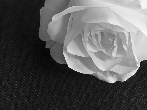
“There is lovely detail and texture in the rose and the image is very sharp. However the top right hand corner of the frame needs toning down to show a bit more detail in the petals. Also you could afford a crop off the left hand side and a smaller crop off the bottom so that the rose fills the frame more.”
I agree with all of this but unfortunately the exposure is such that no more detail can be extracted from the file – all I succeed in doing is producing flat grey. I discussed this by e-mail and Peter advised leaving the top right corner as is, so the final version becomes:
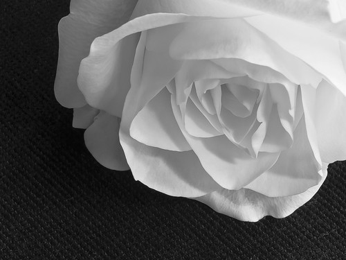
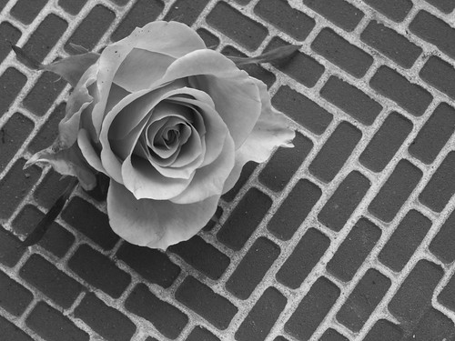
The second image was a closer shot to start with:
“Again you have lovely detail in the rose and the sandstone texture is more attractive than the fabric and this time the rose fills more of the frame. As the previous shot it is a touch light in the top right hand corner, but this time it is more acceptable. From your notes you say you used ISO 100 so is noise reduction really necessary?”
The reason for the use of noise reduction was that I did some fairly hefty post processing on this image, (as noted in the submission) and I felt it was needed to improve the overall quality of the image. Again the exposure meant I did not have the option to produce significantly more detail in the top RHS, so after discussion with Peter I decided cropping more tightly on the right would improve the image overall, as follows:
I nailed the exposure more effectively in image 3 – perhaps because I moved away from a pure white rose to a peach one.
“The exposure on this one is very accurate and the subject is nicely placed within the frame so your technique is spot on. However, for me, the wire grid is a bad choice of background and gives the image an “untidy” look.”
I am in two minds about this one – the ‘untidiness’ was deliberate and if anything my concern is that it as not enough of a contrast – perhaps barbed or razor wire would have been better for this particular effect. I also struggled to get the luminosity of Adam’s Rose – perhaps because the tone of the rose was too similar to the colours in the background. On the other hand a number of friends and at least one fellow student thought this was the best of the six, so there is clearly a measure of personal taste in this discussion.
The 4th image uses the same rose, and again on a similar colour background, but is more attractive in my tutors view. I tend to agree and suspect this is at least partly because of the more effective contrast between the rose and the strong geometric pattern.
The actual comment reads: In contrast to the previous image this one is more pictorially attractive. The tiles form a very nice background and run diagonally across the frame which adds interest for the viewer. The rose itself is also nicely placed within the frame and again there are no burnt out high lights. Nice one.
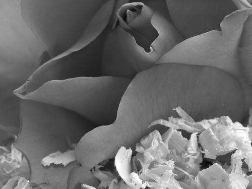
For the 5th image I chose a red rose, which I contrasted with some pale wood shavings. This tonal separation allowed me some leeway to try to increase the apparent luminosity of the petals while still retaining some feel for their rich tones and textures.
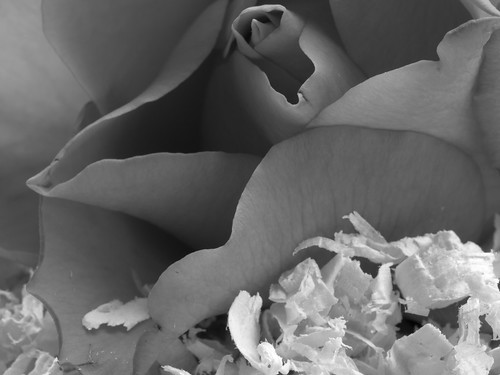
“The shadows on this one are just a touch too dark, but the subject fills the frame nicely and the wood shavings make an attractive foreground.”
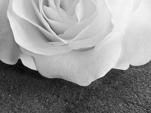
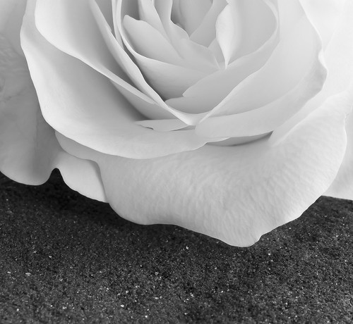
I have produced a version with the deepest shadows lifted slightly, which, as Peter suggests is an improvement on my original. I notice also that there is an important typo in my submission. The diagonal of the composition runs bottom left to top right not bottom right to top left as written. The final version for assessment is here:
And so to the last shot, and my overall favourite.The deep red of the rose and the dark blue of the denim in this one gave me the most opportunity to use the sliders to separate the rose from the background, and adjust its tonality and luminosity without significant impact on the rest of the image.
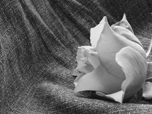
Peter agreed with my choice of favourite: “According to your notes this is your favourite image from the set and I whole heartedly agree with you. The rose is placed just a fraction too much to the right of the frame, but the texture and detail in this image are lovely. Even the highlights are not burnt out. The curvature of the denim from the right leads the viewers eye to the rose itself making an excellent composition. Brilliant.”
A good way to finish.
Conclusions
I had never tried serious black and white photography before so I found this assignment challenging to start with. I understood the theory of different coloured filters well enough, but had never attempted a practical application before. My overall aim was to capture something of the spirit of Rose and Driftwood – I’m not vain enough to think that I could replicate an Adams photo.
So, what have I learned:
- black and white photos can take more ‘abuse‘ in post processing than colour photos before the quality begins to suffer. Not sure this is a good thing to take away, but it is undoubtedly useful knowledge.
- the filter sliders in Lightroom provide a very powerful tool for separating tones, but it certainly helps if you think about the colours and the desired effect before you set up the photo.
- stripping away the colour can provide an interesting interpretation of even the most colourful subjects.
- black and white is worth further exploration.
Footnote: I put my learning from this assignment to further use in Assignment 5 which is also Black and White – this is not something I would even have considered before starting this course.
As a further aside I was also quite pleased that I managed to avoid any ‘attention to detail’ points such as those highlighted in the previous two assignments.


No comments:
Post a Comment